A navigation bar is one of the most important parts of your website. It helps visitors understand your site structure, move between pages easily, and quickly find what they’re looking for.
While Notion offers a basic navigation option on paid plans, it has limited customization. With Super, you can create a fully customizable navbar with dropdown menus, branding, call-to-action buttons, and style controls — all without writing code.
Here’s how to set it up.
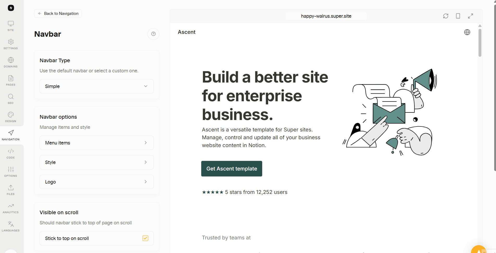
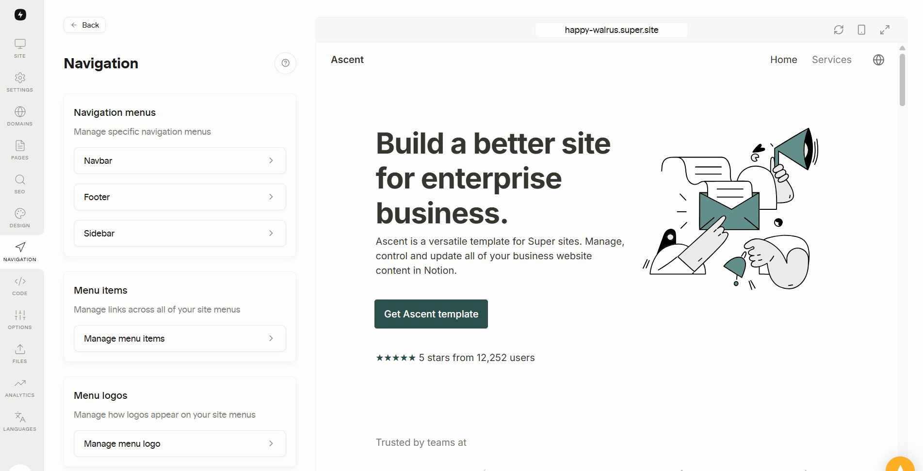
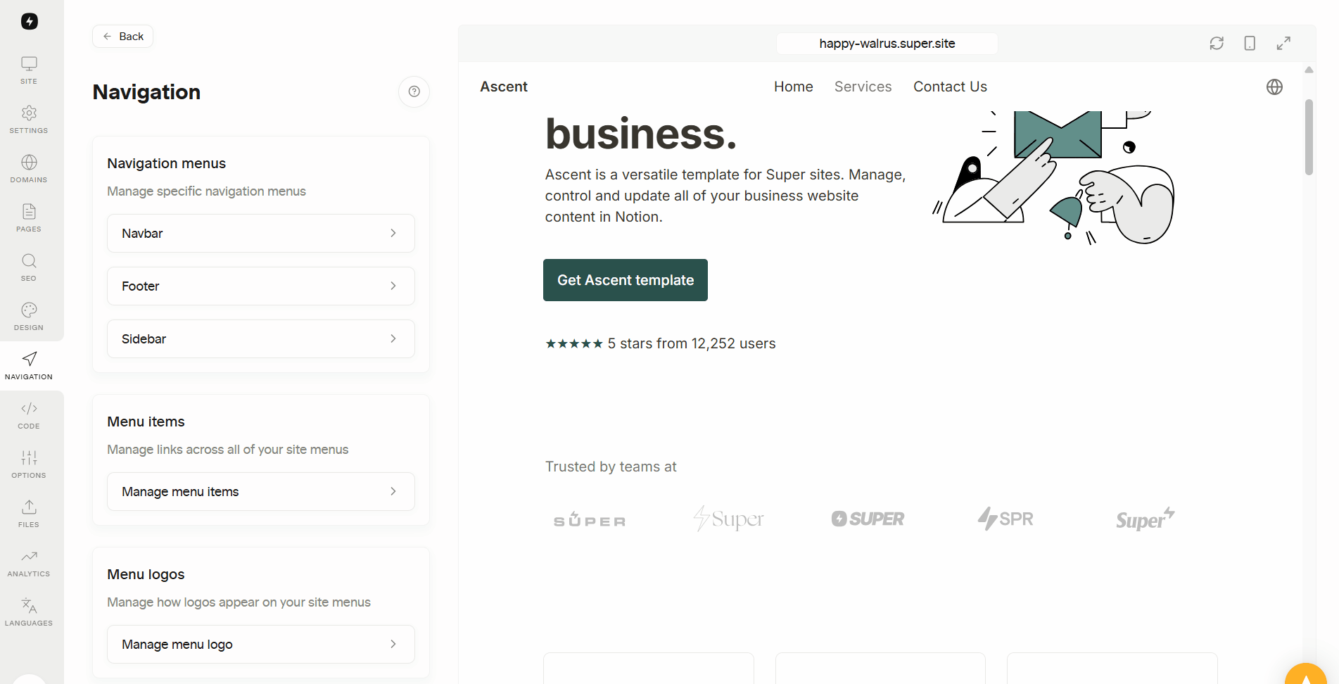
1. Go to Navigation Section
In your Super Dashboard, go to Navigation→ Navbar and choose your layout:

2. Select your Navugation Type
- Default – Displays an automatically updated breadcrumb (not customizable)
- Simple – Links aligned to the right
- Balanced – Links centered in the navbar
- Minimal – Links placed inside a hamburger/overflow menu on both desktop and mobile
Choose based on how many pages you plan to display and how minimal you want the layout to feel.

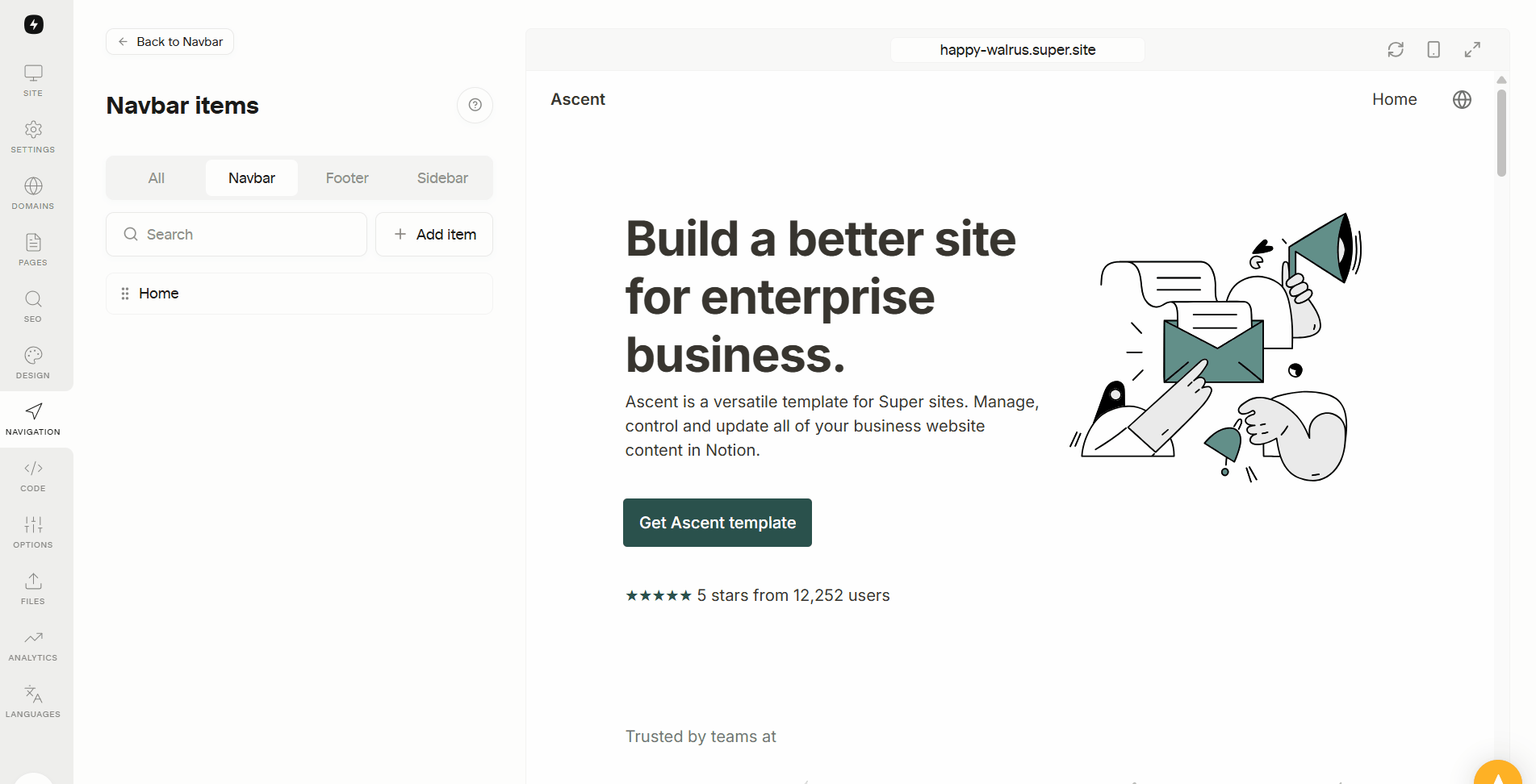
2. Add Menu Items to Populate the Navbar
To make your navbar functional, you need to add links:
- Go to the Menu Items section
- Click Add Item
- Choose:
- Page (for internal pages)
- URL (for external links)
- List (one level Subitems)
- Add a title and choose a subpage
- Save Changes
You can drag and drop links to reorder them or remove them anytime.
If your navbar becomes crowded, consider switching to the Minimal layout.
Create a Dropdown Menu
For larger websites, you can organize related links under dropdown menus.
This keeps your navbar clean while still making multiple sections accessible.
Navbar List are especially useful for documentation sites, blogs, or multi-section business pages.
3. Add a Logo or Site Title
Branding your navbar improves recognition and professionalism.
You can upload your own logo at the bottom of the Navigation section:
- Choose Text to display your site name (emoji supported)
- Or choose Image to upload a logo
- Adjust the size using the width slider
- Modify font size if using text
Keep the logo size balanced so it doesn’t overpower the navigation links.
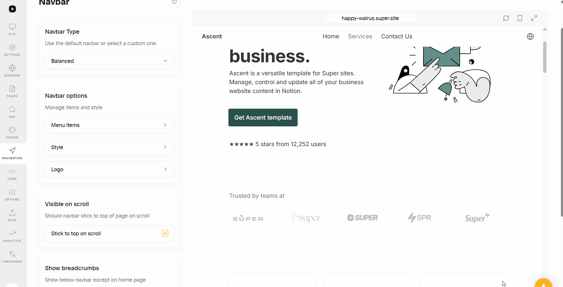
4. Customize the Navbar Style
In the Style section, you can adjust:
- Background color
- Text color
- Height
- Visibility on scroll (sticky or fixed)
- Shadow (size, color, opacity)
You can input HEX, RGBA, or HSLA values if you need exact brand colors.
Always preview your design in both desktop and mobile view before publishing.
5. Add a Call-to-Action (CTA) Button
A CTA button appears on the far right of your navbar and helps highlight a key page.
To set it up:
- Add a button title
- Select a destination (Page or URL)
- Choose background and text colors
This is commonly used for:
- Pricing pages
- Free trials
- Downloads
- Contact forms
Keep the CTA clear and action-oriented.
6. Add Breadcrumbs to Pages
If you want breadcrumbs on specific pages:
- Open the page in Notion
- Type
/breadcrumband insert the Breadcrumb block - Return to Super
- Click Refresh in the dashboard
Note: Breadcrumbs reflect your structure in Super, not your internal Notion page nesting.
Publish Your Changes
Once everything looks right:
- Click Save Changes
- Wait for the sync to complete
- Refresh your live site
Your custom navbar is now active and ready for visitors.

You can set up a native navigation bar in Notion that lets visitors move between pages and access key sections. While Super adds extra customization options, the basic navigation itself works fully in Notion. Learn how to create it in our Notion navbar guide.
FAQs
What is a breadcrumb menu in Notion?
How to navigate in Notion?
What is the shortcut for Notion navigation?
Learn more


